Les mots les plus utilisés dans les titres de fantasy.
Posté : lun. août 23, 2010 7:55 am
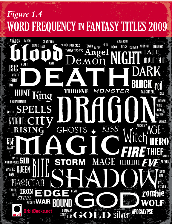
Le site anglais d'Orbit a mis en ligne un article sur les mots les plus utilisés dans les titres des romans de fantasy en 2009.
Voici le résultat :
"First off, lets look at the content of 2009′s fantasy titles. This was a new category of inquiry for us this year and there were many surprises in store once the data was collected and analyzed. In the chart above the size of the word is in proportion to the number of books on which it appears in the title (no subtitles or series titles this time). As you can see, there are some pretty predictable words in heaviest usage: “Dragons”, “Magic”, and “Shadows” were no-brainers. However we were surprised at how high “Death” rated — was fantasy turning dark and morbid? (or more dark and more morbid than usual, at least?) But no, there was a single culprit to blame. All the Sookie Stackhouse books were re-released last year because of True Blood’s success, and that accounted for the extra “Death” usage.
Now let’s discuss the style of the 2009 titles. Even for those of you out there who can’t name at least 500 fonts on sight (that’s not even a lot for a graphic designer, says the art department) it’s pretty obvious there are some main categories of type styles. The pointy goth screams-vampire-book fonts (Mason, Democratica) are holding strong in the Urban Fantasy department, while epic fantasy books are split between a classic serif* look (Priori Serif, Jupiter) and the wanna-be-retro-futuristic look (Industria). Really, with over 10,000 quality fonts on a designer’s computer at any given moment you think we’d shake it up a bit more, but fonts are as susceptible to clichés as cover art. We are particularly looking forward to the historical style we’ve seen creep in with some of the steampunk books translate to some fresh type styles, as Boneshaker was a particular fave among the typography geeks in 2009."